Our support for two special needs schools has encouraged us to think about how we can make the things we do more accessible to all. And various members of my family suffer from dyslexia, autism, and dyspraxia. So, it seemed about time I learnt more about making the work I do more accessible to others. Plus Brenda Roper from B & D Roper HR constantly pulls me up for poor accessibility style in my presentations!
Hence this article.
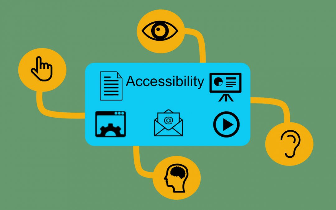
Accessibility is often thought of as the concept of whether a product or service (such as a website or mobile application) can be used by everyone—however they encounter it. But in this article, I have applied accessibility to all the digital works we create and use each day – such as emails, documents, presentations, and video meetings. In the UK about one in five people have some form of disability which could be hearing, visual, motor (affecting fine movement) or cognitive (affecting memory and thinking).
So, unless we think about making more of what we do accessible, we are making life difficult for at least 20% of the people we interact with – teammates and colleagues, customers and suppliers and friends and families. But of course, good (and bad) design affects all of us.
Many of the techniques to improve accessibility are just common sense really, whilst others take a bit more thinking about. In this article I’m going to provide some simple tips for you to use every day and in part two I’ll review some of the tools the tech firms provide to help with accessibility.
Accessibility Tips
Many of these tips will help all of us better and more easily understand the message we want to convey, whilst others are more specifically aimed at those with a disability. Some people will use screen readers to read a document or webpage and so some of the tips below are necessary for these tools to make sense of a document.
- Clear structure and good use of headings. Structure is good – it means your thoughts are organised and makes it easier for others to follow you. Headings help “describe” the structure and enable people with poor eyesight (and screen readers) to follow a document. But you need to use heading formatting – not just make text bold or the font bigger.
- Layout. Left aligned text is better for those with dyslexia and avoid the use of multiple newspaper style columns. Break up the text with clear spaces and use diagrams or images to complement the text.
- Writing style. Use clear simple language to communicate effectively with short sentences of about 15 to 20 words and in the active voice. The Grammar Monster provides a good description of active voice.
- “alt text” with images. Alt text (or alternative text) provides a description of an image and is used by screen readers for the visually impaired and website search engines. Microsoft now includes the capability to enter alt text with images in Word and PowerPoint. Alt text should be brief (no more than 150 characters), add value (i.e. not just repeat what’s already in the text) and not use a phrase like “… an image of …”. This last point is an error I have frequently made!
- Lists and bullets. These are easier to understand than large blocks of text. • San Serif fonts. Fonts such as Ariel, Comic Sans, Verdana, or Calibri are all better for people with dyslexia as they are not so complex.
- Colour and colour contrast. Use single colour backgrounds with sufficient contrast between background and text. Consider using pale coloured backgrounds (such as cream or a soft pastel colour) as an alternative to white, which can appear quite dazzling. Don’t just use colour as a navigation tool – consider using icons coupled with colour.
![]()
- Meaningful hyperlinks and button text. So for example, the text in this hyperlink Microsoft accessibility tools is much more helpful than just “Microsoft”.
- Video captioning and blurred backgrounds. In video meetings use real time captioning where available to enable those with hearing difficulties to follow along. The blurred background feature in Microsoft Teams video is there to enhance a participant’s face to make lipreading easier.
There’s my top tips – not so difficult really. Ive used Microsoft’s accessibility checker on this document and it says Ive done OK. Lets hope it right.
In my next article I’m going to look at some of the tools provided by the tech firms to help with accessibility.
If you’d like to get a head start here are some links to follow:
- Microsoft committed to accessibility
- Apple, technology that empowers everyone
- Google, everyone should be able to access and enjoy the web.
If you would like help accessing or using accessibility tools. Please call us on 10428 770 290 or drop us a note to info@paac-it.com.

